
Forum › Forums › antiX-development › Graphics › antiX flat — wallpaper to modernize
- This topic has 32 replies, 10 voices, and was last updated Jul 10-8:01 pm by Anonymous.
-
AuthorPosts
-
May 21, 2019 at 4:44 am #21882
Anonymous
Original images ‘antiXized’:
May 21, 2019 at 4:50 am #21893May 23, 2019 at 5:17 pm #21967 christopheModerator
I like these. Thank you.
antiX on everything, since 2017
June 2, 2019 at 9:52 am #22422New logo, antiX not Antix, ‘modern’ flat and still, in style of “the old logo appeals me more” but, “I only wish i could get in better quality” (which would now also be possible, since we know which font was used).
June 3, 2019 at 6:24 am #22486Somebody might eventually like it …
June 10, 2019 at 9:56 am #22756“Too much yellow also can cause people to become critical and demanding.”
http://www.bourncreative.com/meaning-of-the-color-yellow/
http://www.empower-yourself-with-color-psychology.com/color-yellow.html
http://www.colormatters.com/the-meanings-of-colors/yellowJune 10, 2019 at 12:11 pm #22763 XecureMember
I like it very much. Super lightweight (maximum 102 KB the antix-urban-yellow-big.png).
The first thing I thought when seeing it was Netflix.Attachments:
antiX Live system enthusiast.
General Live Boot Parameters for antiX.June 10, 2019 at 2:29 pm #22767 manyroadsMember
Does nothing for me… I’m obviously too old and just not a big fan of Gotham City motifs. 😉
Pax vobiscum,
Mark Rabideau - http://many-roads.com
"For every complex problem there is an answer that is clear, simple, and wrong." H. L. Mencken
dwm-i3wm ~Reg. Linux User #449130
2026- the Second-Coming, Came-- and it's a train wreckJune 10, 2019 at 3:00 pm #22770Thanks noClue downloaded both dark walls.
June 10, 2019 at 4:36 pm #22772BobC
ModeratorI think the antiX carbon one, if you changed the background color to a somewhat dark “antiX” blue, and moved the wording far to the center or left of center (to balance the conky on the right), would look good to me. I would think it would be a small file usable for grub, slim, and background. To be honest though, will that look better than the new 19 background?
But all of these things, likes or dislikes are “personal preferences”. I guess at some point decisions need to be made as to which choices will attract users enough that they try the distro.
If someone doesn’t have a lightspeed fast system, they will really FEEL the difference running antiX, with regards to functionality, flexibility,stability and performance, but it needs to be attractive enough that people will give it a try or they would never know that.
I know, its just my 2 cents worth…
PS: Can I ask what font that is? I ask because even though it’s probably “totally wrong”, what if there was a capital A in front, but lowered so that the line has to jog down to start it below the line, and at it’s top it reaches the height of the n and then ends at or below the line flowing into the n.
- This reply was modified 7 years, 3 months ago by BobC.
Here is the link to SEARCH THE FORUM >> http://www.antixforum.com/search-forums
June 10, 2019 at 6:38 pm #22773 Brian MasinickModerator
Worth more than 2 cents. Good feedback.
--
Brian Masinick
Alternate "Search B":
This search pageJune 10, 2019 at 11:22 pm #22775@ BobC
It is antiX (not AntiX or ANTIX)
The font is Gandalf Regular if you go to this link link click on Playbox you can type your own words with this font and use screen capture to save your text..
Thanks to noClue for this link..
June 11, 2019 at 12:59 am #22776I think the antiX carbon one, if you changed the background color to a somewhat dark “antiX” blue …
It wouldn’t be ‘carbon’ if it would be blue. However, changing color is done in a matter or seconds. See?
(Change the Wallpaper Color)… and moved the wording far to the center or left of center …
That doesn’t look good. Good look is a matter of rules and not tastes.
Why is it positioned as is? Rule of thirds
(I am online with you — antiX)(to balance the conky on the right)
It’s perfectly well balanced in conjunction with Conky unless, you’re using a wrong Conky. 😉
Easy solution — change the Conky!
(Conky-Balance)… a small file usable for grub, slim, and background.
Again — you have to learn to see the importance of proper DEFAULT settings and understand that it’s not a ‘matter of personal taste’ but science and rules.
The same is truth for the appearance of an OS. Changing the icon set will not ‘make it more modern’. You have to see it as ‘the whole’.… will that look better than the new 19 background?
Of course it will.
Boot-Screen 1
Login-Screen 1
Desktop-Look 1Boot-Screen 2
Login-Screen 2
Desktop-Look 2… decisions need to be made as to which choices will attract users enough that they try the distro.
The look alone might attract people to try the distro but, the look alone will not help to KEEP the people at it.
antiX is quite the opposite of ‘Lean and Mean’ — that’s the sole reason for the ‘PRobOS’ thread.
‘PRobOS’ doesn’t exist — it was just a resarch / UI/UX study — for students to learn.… with regards to functionality, flexibility,stability and performance, but it needs to be attractive enough that people will give it a try or they would never know that.
antiX has limited functionality and questionable stability (because of Debian) but, the performance is very fine indeed.
‘Attractive for people’ is if it’s made for people — antiX is not made for people — that’s why PRobOS thread.
On the other side, who’s still using 20-year old 32-bit PCs is ‘people’, not people.I know, its just my 2 cents worth…
It created a motivation, to write you the answer and explain little bit more on, what should result in a better antiX one day.
If you after all, still want a left hand sided antiX, on a blue carbon background, here it is.
You can download it if you want but, such ‘accident’, I can’t upload here.June 11, 2019 at 11:22 am #22787ModeratorThat was real nice of you to tweak that for me… Thanks a lot! And thanks for the lesson on design.
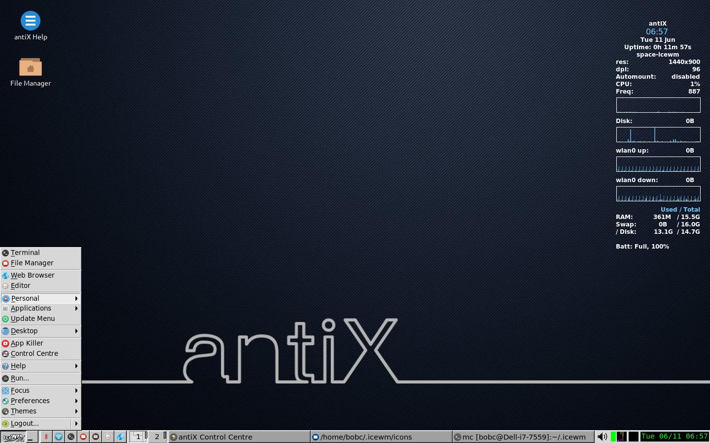
Yes, I know I’m not a design artist. Sorry for that. I suppose the antiX could go in the center 1/3 horizontally just fine.
The position of the conky for me is best off to the side so that I can position windows to see it when I want to without wasting a lot of space. My toolbar is tweaked the way I like it, ie with WiFi icon, network and cpu monitors, and day/date/time.
Here is how it looks on antiX 19 with standard conky and desktop icons. I think it looks real good. Thanks again…
Attachments:
Here is the link to SEARCH THE FORUM >> http://www.antixforum.com/search-forums
June 11, 2019 at 12:04 pm #22789manyroadsMemberNice job @BobC
Pax vobiscum,
Mark Rabideau - http://many-roads.com
"For every complex problem there is an answer that is clear, simple, and wrong." H. L. Mencken
dwm-i3wm ~Reg. Linux User #449130
2026- the Second-Coming, Came-- and it's a train wreck -
AuthorPosts

- You must be logged in to reply to this topic.